Getquin
All your assets in one place
Role
Product Designer
Scope
Discovery & Specification UI & UX Design
Industry
Fintech
Summary
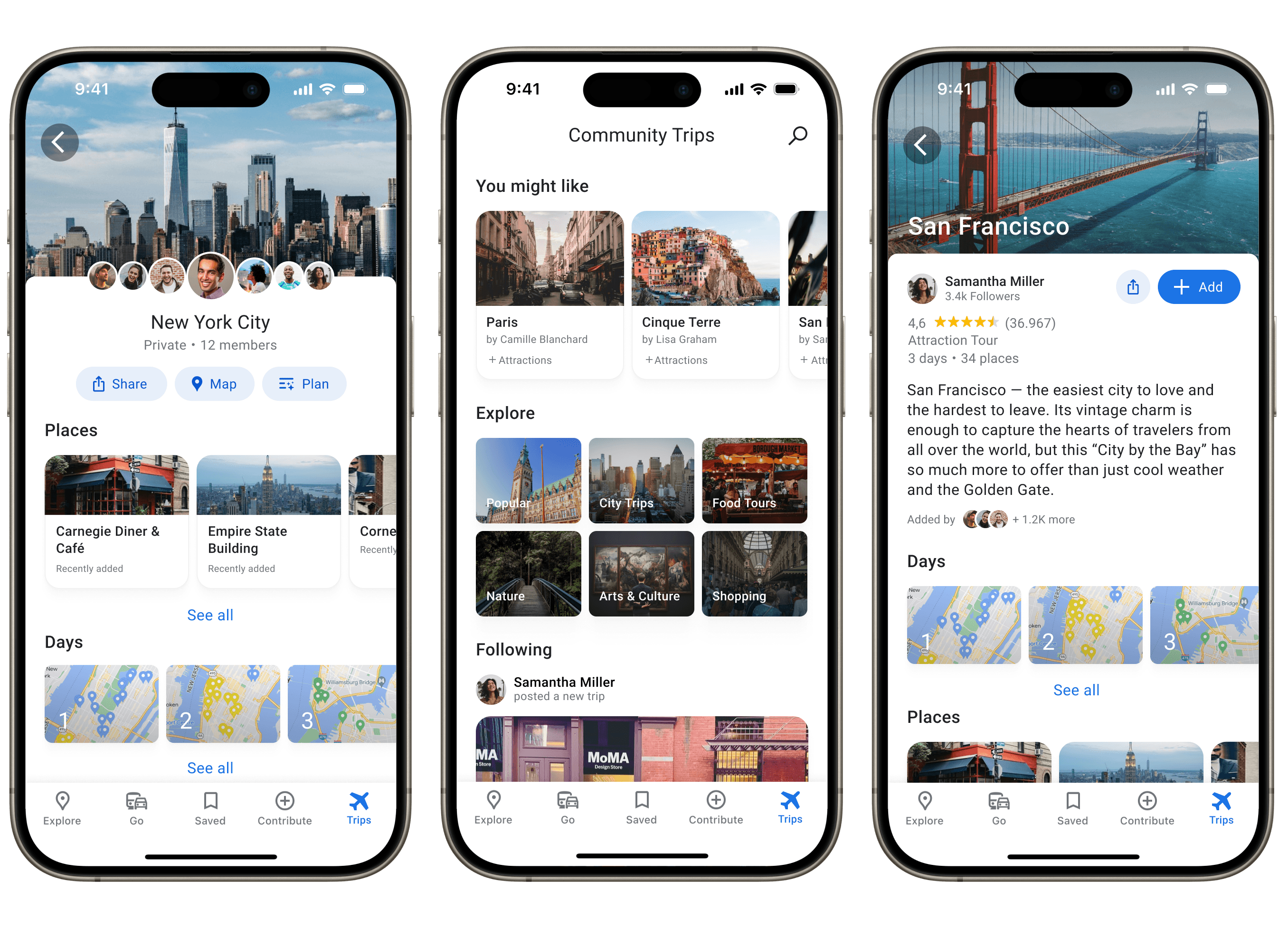
Getquin is a stock tracking app that offers users in-depth portfolio analytics, market insights and one of the largest social investing communities in Europe. On their product team, I led the redesign of the user portfolio chart, launched a new monetization strategy and updated the onboarding experience, leading to a jump in active subscriptions and user growth.
Portfolio Charts
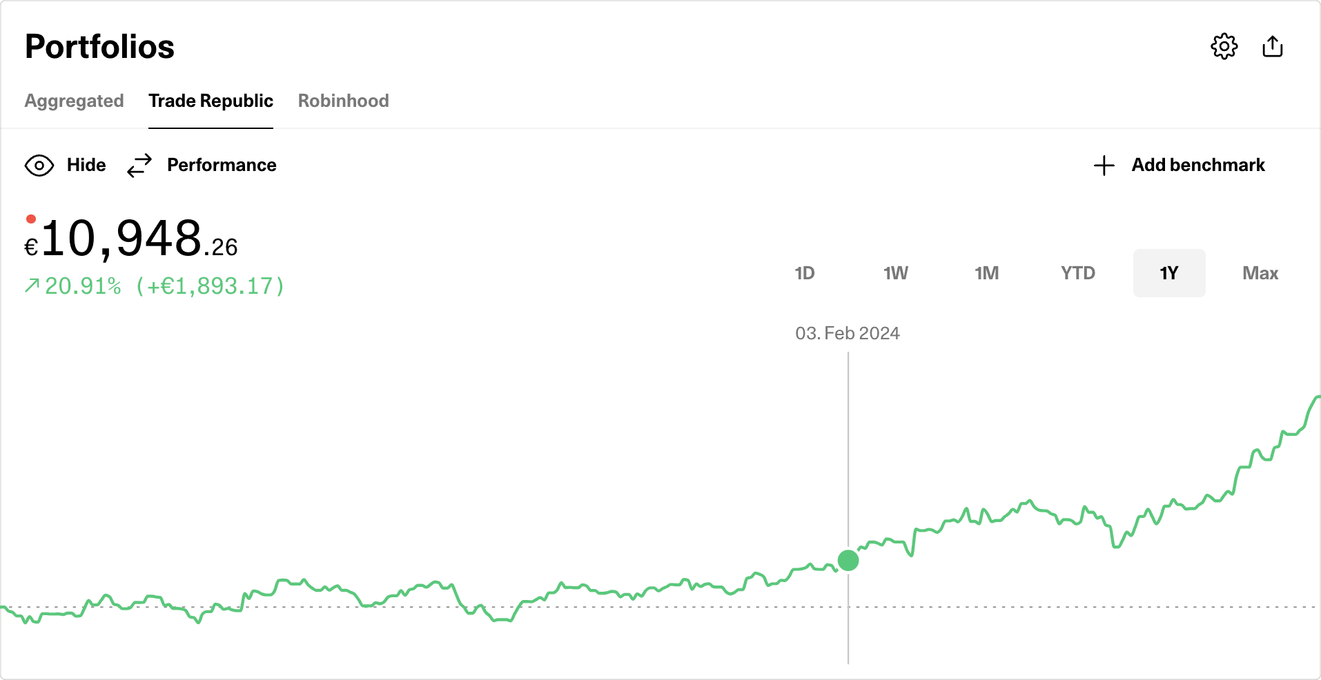
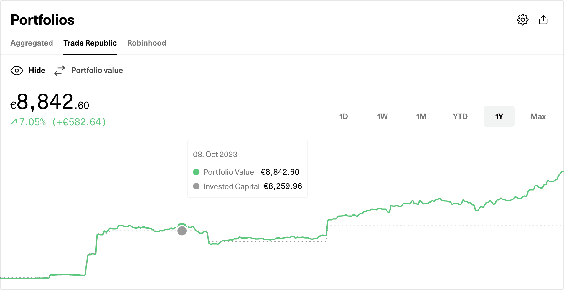
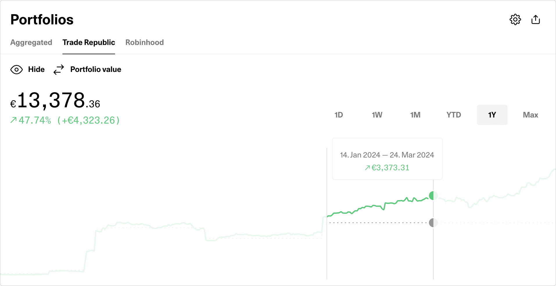
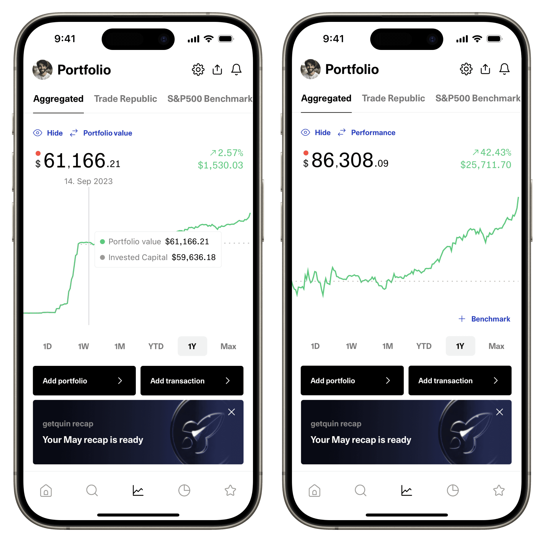
Helping investors understand their portfolio performance at a glance
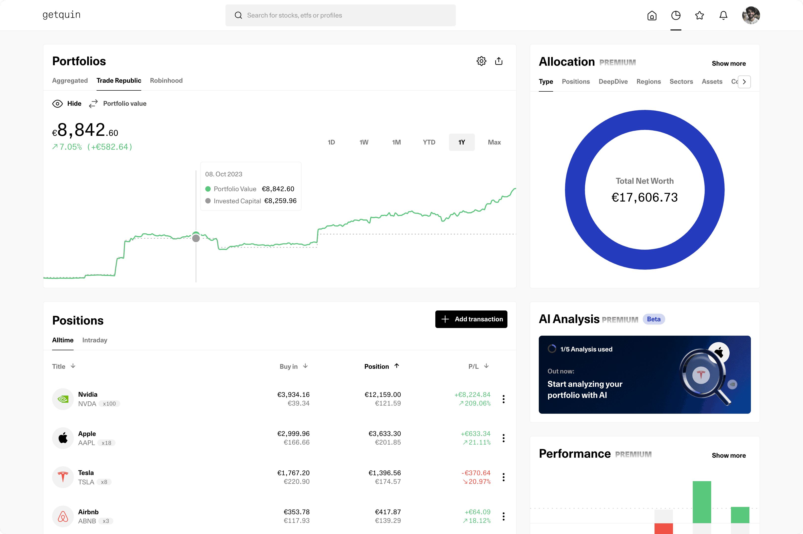
Relative gains are different from the overall portfolio value gains - but this is not always obvious to investors. The redesigned chart module clearly separated the relative performance and portfolio value charts and introduced new affordances to communicate the difference between the two types. I led the feature development end-to-end including research, design and implementation to solve a core confusion that users were struggling with.










Onboarding
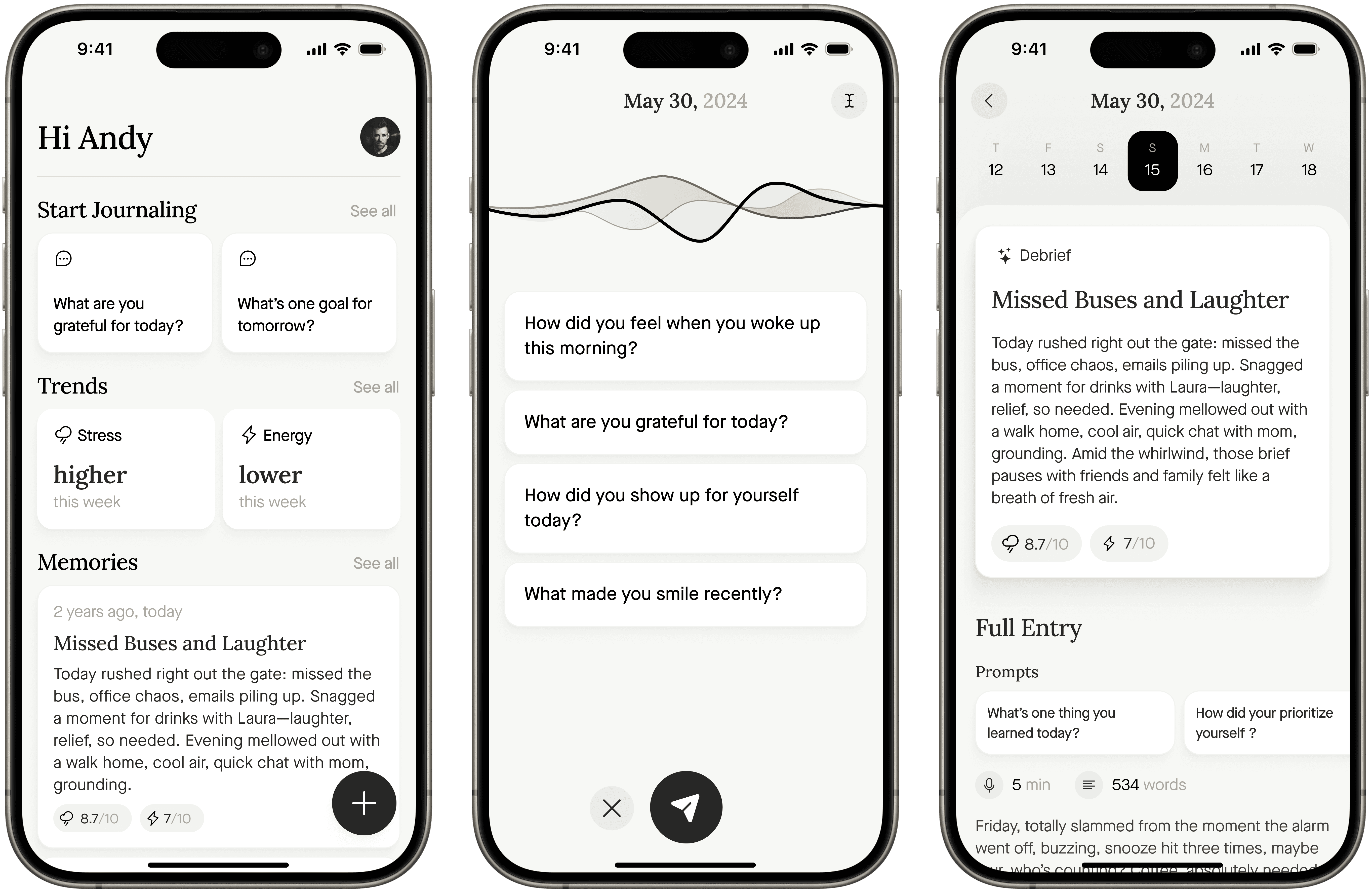
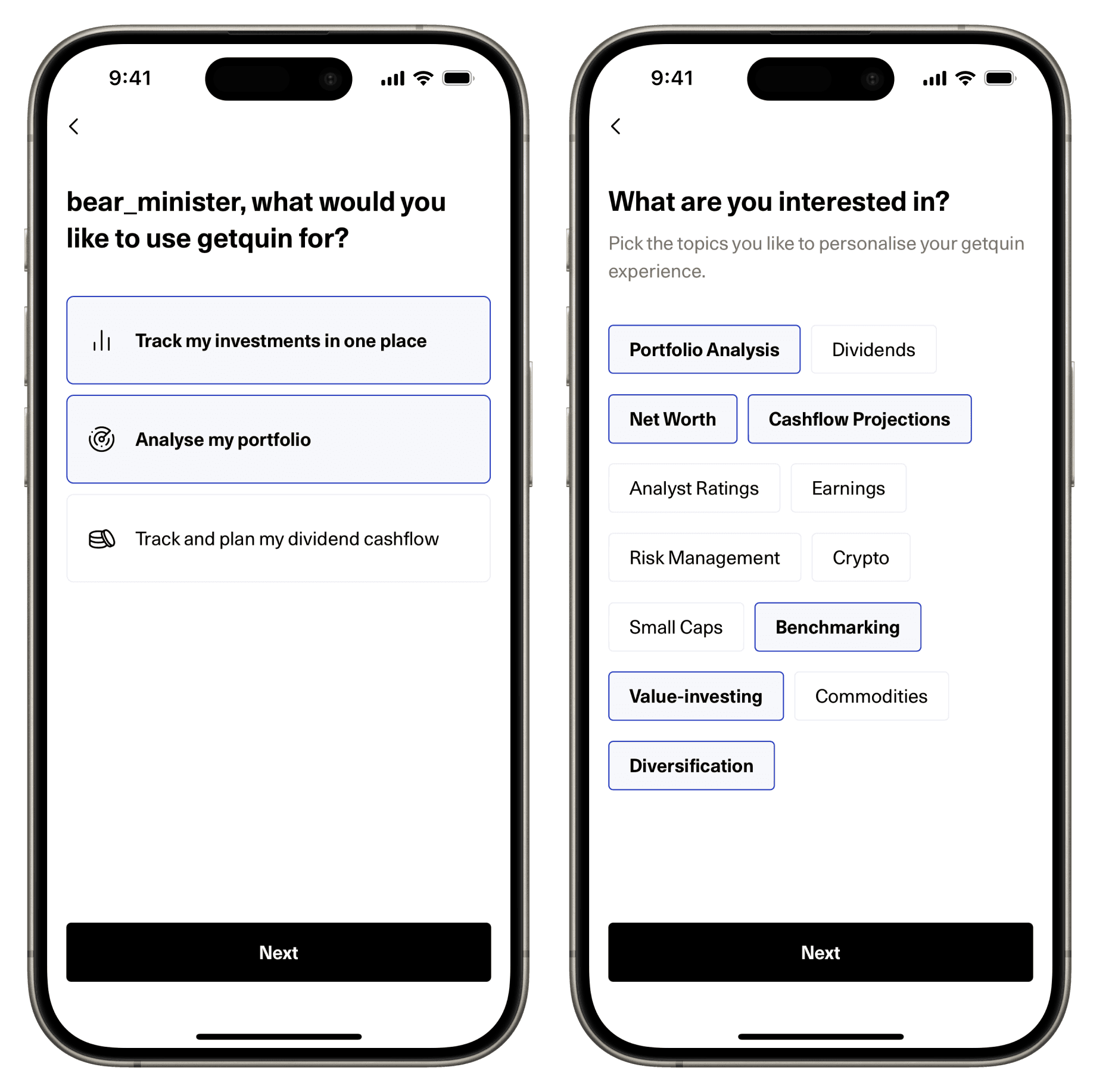
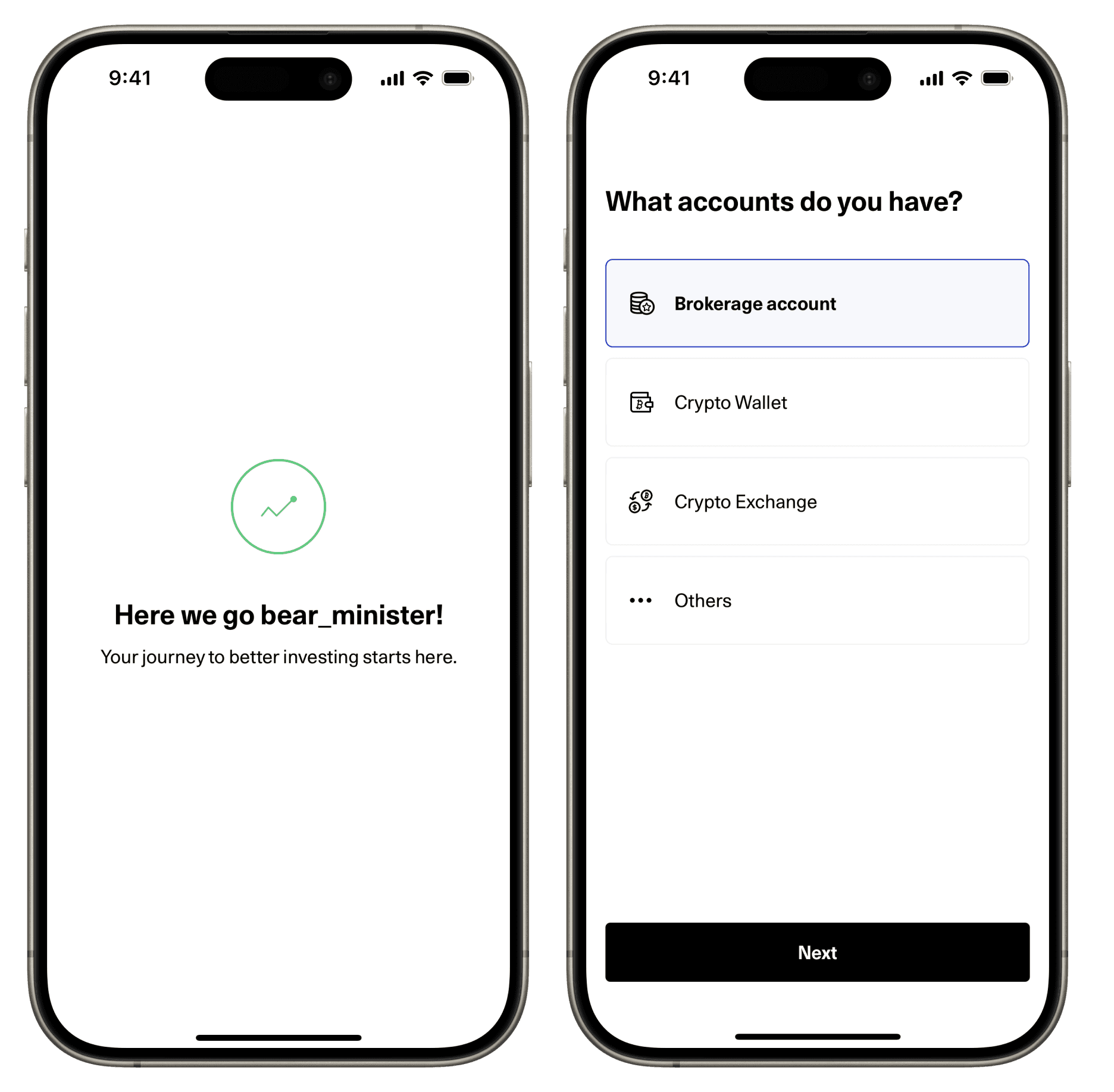
Revamping the onboarding to achieve a better in-app experience
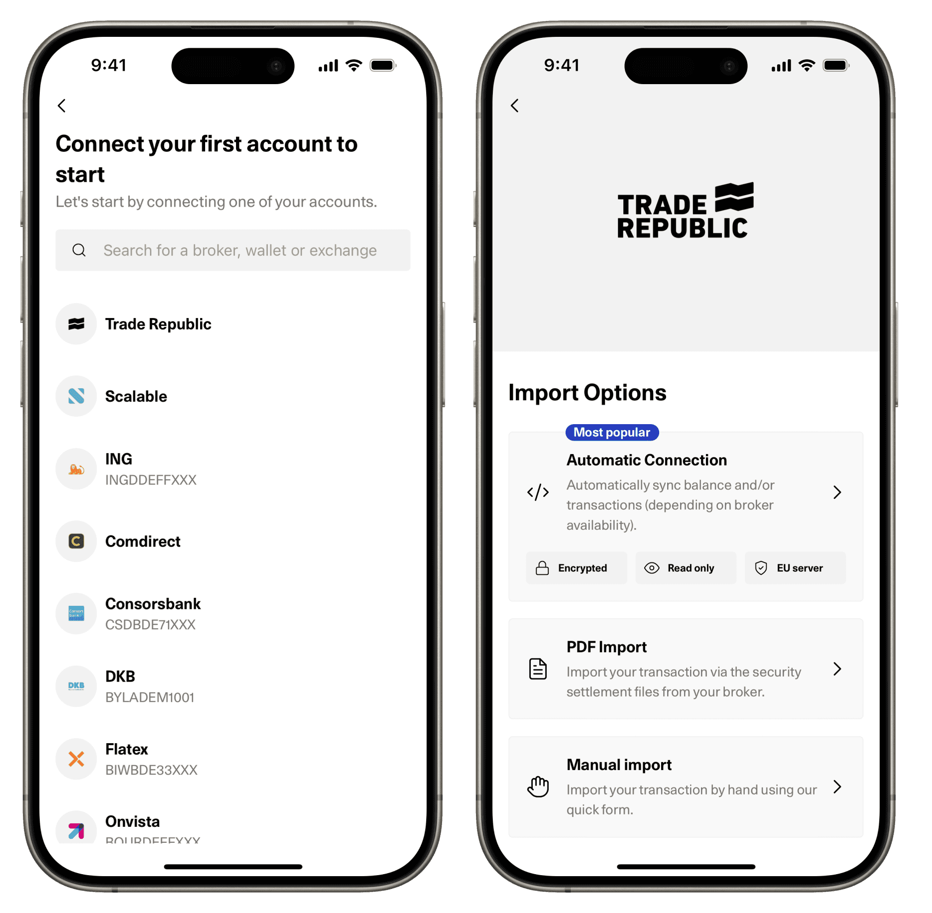
Users frequently complained that too many setup tasks remained after finishing onboarding. Time to magic was too long and took too many steps. The updated onboarding experience included customization options for user goals and topical interests. To further address an important friction point, we turned the portfolio import into a required step in the onboarding and added nudges to the auto-import feature. As a result, users could use more of the app's features from the get go and user activation increased.






Upgrade Flows
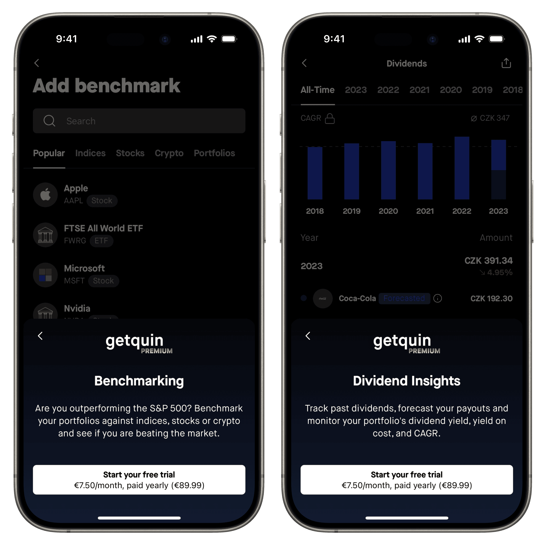
Creating better feature visibility and upgrade experiences
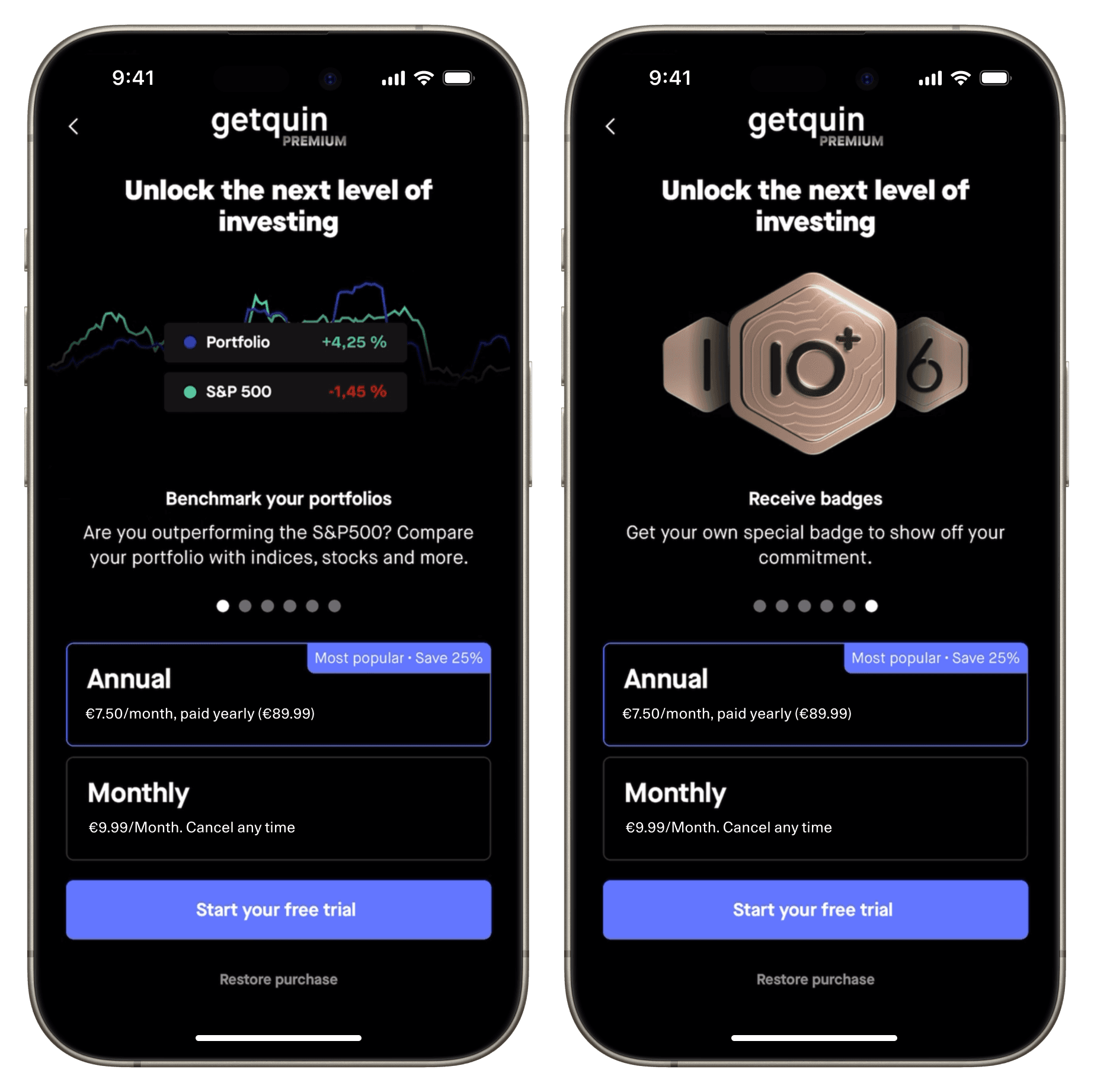
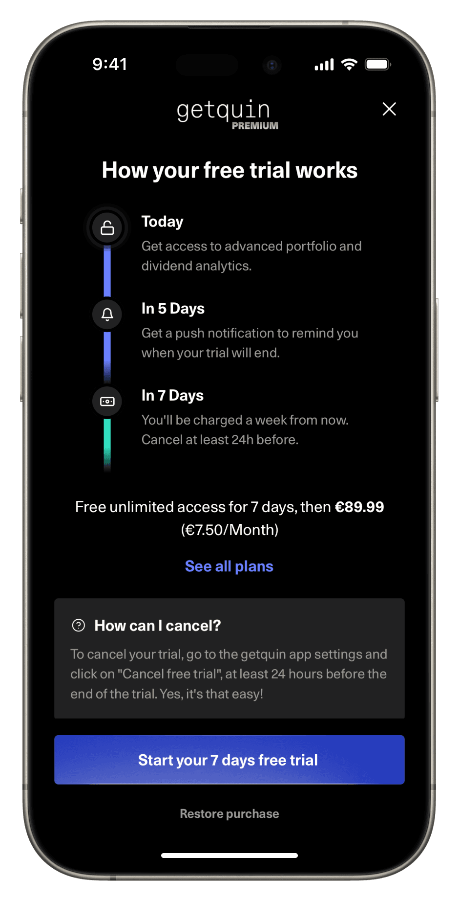
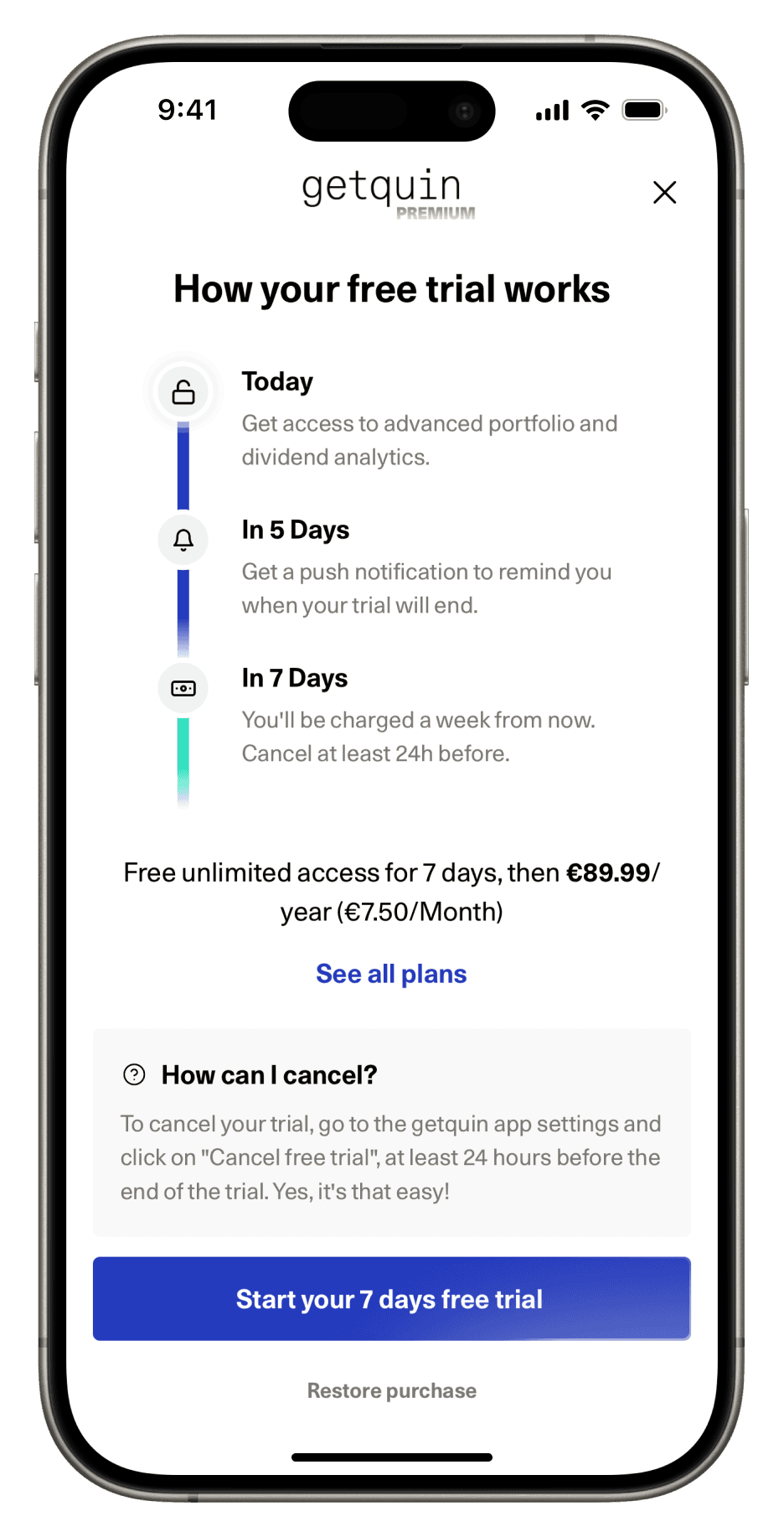
Many users were not aware of recently launched features and didn’t see enough incentive to upgrade. Based on this feedback, we improved visibility of premium features with upgrade popups where they are most useful to users. In addition, we A/B tested carousel and timeline-based paywall designs. After settling on the timeline-based design, new subscriptions spiked and user feedback showed they were more likely to upgrade knowing about recent feature additions.








See next
See next
See next
About
Lukas Maschmann is a Product Designer. After spending his time in high school performing as an Opera singer and sketching interfaces in class, he studied Technology and Human-Computer Interaction at Università Bocconi, Milan and the University of California, Berkeley. He has since built products at both unicorns and early stage startups in Fintech, SaaS, and AI.

